 Hypsometric maps are maps of the surface that depict relief or elevation. This can be shown by color, contour lines, or raised relief. The map above uses color to show elevation in a Cuban Archipelago. Shading gives the map a three dimensional view, which helps to portray elevation on the map.
الأحد، 6 سبتمبر 2009
Hypsometric Map
Hypsometric maps are maps of the surface that depict relief or elevation. This can be shown by color, contour lines, or raised relief. The map above uses color to show elevation in a Cuban Archipelago. Shading gives the map a three dimensional view, which helps to portray elevation on the map.Choropleth Map
 The choropleth map is based on predefined areal units, such as states, counties, census tracts, etc. Areas are shaded or patterned in proportion to the measurement of the statistical variable being displayed on the map, such as population density or per capita income. Above is an example of a choropleth map created on the U.S. Bureau of the Census it reveals the number of males per one hundred females in the year 2000.
 Proportional Circle Map

In proportional circle maps data is displayed by the size of the circles on the map. The map of Europe above is displaying the number of internet users in the country in the year 2004.
Isoline Map

Isoline Maps use continuos lines to join points of the same value. They are often used to portray the weather such as highs and lows in temperatures or levels of precipitation in a particular area as exampled by the isoline map above displaying high temperature.
Flow Map

Flow maps show the movement of objects from one location to another, such as the number of people in a migration, the amount of goods being traded, or the number of packets in a network. The advantage of flow maps is that they reduce visual clutter by merging edges. Most flow maps are drawn by hand. The flow map above shows proposed satellite locations linked bthrough five States.
Map Catalog
http://www.amphibiaweb.org/amphibian/cartograms/cart_global_diversity.jpg
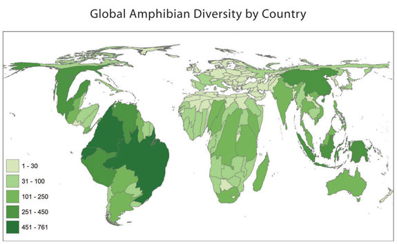
A cartogram is a map in which a mapping variable – such as travel time is substituted for land area. The geometry or space of the map is distorted in order to convey the information of this alternate variable. There are two main types of cartograms: area and distance cartograms. The map above would be a area cartogram as it displays diversity of amphibians throughout different countries.
A cartogram is a map in which a mapping variable – such as travel time is substituted for land area. The geometry or space of the map is distorted in order to convey the information of this alternate variable. There are two main types of cartograms: area and distance cartograms. The map above would be a area cartogram as it displays diversity of amphibians throughout different countries.
الاشتراك في:
التعليقات (Atom)